The RAND Health Insurance Experiment is referenced in the academic literature as a “gold standard” study, and the main conclusion it reached aligned perfectly with what Econ 101 teaches us — when people have to pay for stuff, they buy (significantly) less of it. It also confirmed that “outcomes” were not worse for those poor devils that are forced to participate fully in a market system (meaning having to pay for things.)
This conclusion was reached again when the results of a two-year Oregon Health Study were announced. Free health care did not result in clear improvements in physical health for the participants.
Another Econ 101 principle shown to be highly applicable in other markets is that when things are free, demand increases. And when demand increases, prices tend to go up. The paradox is that while places like France and the U.K. are regarded as highly socialized in the delivery of health care, their costs are well controlled compared to the “free market” of the U.S.
The question is, how do you define a market as “free” vs socialized? Many would say that you’d be hard pressed to come up with a better metric than the percentage of health costs paid directly to health care providers out of patient’s own pockets.
Luckily The World Bank has calculated that for us. I found the numbers surprising — that is until I realized they aligned perfectly with what Econ 101 tells us.
We all know that many in the U.K. bypass the NHS (with good reason) to go private with their care. I just did not realize the size of those numbers.
According to World Bank, over 50 percent of costs are paid out of pocket in the U.K. France? 32 percent. Canada? 49 percent. The free market “wild west” that is the U.S.A.? A measly 21 percent. That’s right. Thanks to the collectivization we call insurance, the vast majority of services are delivered to people who don’t care about the bill.
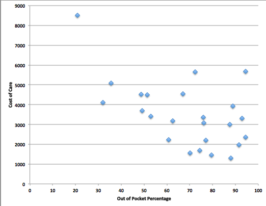
OK, so I’ve tossed out a few examples here, but what does the data tell us? Let’s compare the two data sets linked above. Prices vs. out of pocket. Here is the pattern:

That’s a correlation coefficient of .51. Compare to the correlation of I.Q. to income, which is estimated to be .40 to .50.
I’d be interested to see other data sets that have been correlated with health care costs. I think one would be hard pressed to find a relevant set with a higher alignment.

4 responses so far ↓
1 Steve Roth // Sep 30, 2013 at 7:16 am
What’s that big outlier upper left? Correlation if that’s excluded? Just curious. Ping me when you answer cause there’s no notification option on this blog.
2 Steve Roth // Sep 30, 2013 at 7:22 am
Also, what countries are you graphing here? The WB data set includes 214, but those obviously aren’t all shown here (probably for good reason).
I have a great little Excel Macro call XY labeler that attaches labels to scatterplot datapoints. Perfect for exactly this kind of graph. Lemme know if you want it.
3 Steve Broback // Oct 6, 2013 at 5:44 pm
I think I have the macro, that’s the USA in the upper left. Spend data here:
http://www.oecd-ilibrary.org/social-issues-migration-health/total-expenditure-on-health-per-capita_20758480-table2
Out of pocket here:
http://data.worldbank.org/indicator/SH.XPD.OOPC.ZS
Spreadsheet here:
https://www.dropbox.com/s/eium04673vtv7jx/health_spend_vs_out_of_pocket.xls
4 Joe Root // Nov 15, 2013 at 1:50 pm
Interesting article!
Both the RAND and the Oregon Health project were underpowered so were unable deliver significant results on health outcomes — though the Oregon project finds improved financial and mental health outcomes which weakly confirm increased healthcare utilization.
Intra-country comparisons are bound to be a bit dubious — do we really think that France is a good counterfactual for the US? There are a bunch of unobserved factors likely correlated with out-of-pocket percentage e.g it’s going to be higher in countries with weak financial institutions (such as developing countries) though you may have dropped the poorest countries.
That plot is pretty striking though.
In my opinion, better evidence for dynamic demand responses is this paper http://www.stanford.edu/~leinav/PartD.pdf
In it, the authors use nonlinear prices for Medicare part D expenditures (such as the “donut hole” where after a certain point, beneficiaries are required to pay a significant fraction of prescription costs) to estimate demand responses.
Leave a Comment